Thanks to the age of technology we live in today, Forex charting is much easier than it used to be. We have access to nice clean price charts on our high resolution trading screens that give us up to the second updates in price changes.
There are many chart formats to choose from and we can even apply our own color schemes and backdrops to pretty them all up.
Reading price charts is easy and convenient these days, but it wasn’t always so…
Before There were Charts
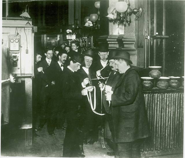
For a long period of time the only way traders could achieve this was through the Ticker Tape system which was a very crude means of Forex charting, if you would call it that.
The ‘Ticker Tape’ was an early electronic communications medium which had the ability to send transmissions over the telegraph network.
A piece of paper strip was fed through a device called a stock ticker, which could interpret the signals sent through the telegraph line and print them out onto the paper strip in a readable format.
The paper strip would work its way through the stock ticker and when it come out the other end the stock ticker had printed the alphabetic symbol that represented a company’s stock followed by the price and volume data.
The term ‘ticker tape’ was given to this system because of the ‘ticking’ sound the stock ticker printer used to make.
The ticker tape setup was introduced in 1870 and was the only way traders could get price updates, until in 1960 the television screen was invented. After 1960 computers and televisions screens slowly replaced the ticker tape until it was eventually made obsolete in 1970.
Floor Traders
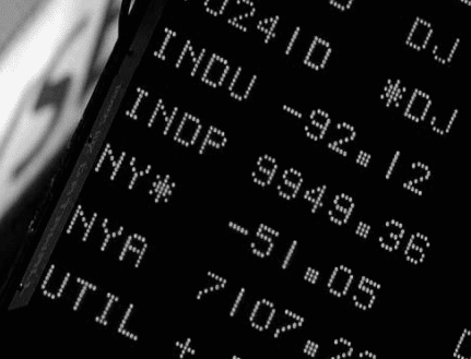
Traders would flock to the exchange floors and only now have to glance up the screens for quick price updates and then use yelling and hand signals to place trade orders with the in house stock brokers.
Floor trading, or sometimes called pit trading was born.
Floor trading worked well for many years and it still used today across all the exchanges.
Now we have got the internet, and it’s much easier to just download your brokers charting software onto your home or work computer and start trading electronically.
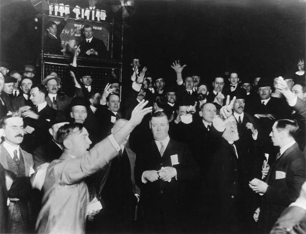
Some people speculate that floor traders may soon become a thing of the past as you don’t need special pit trading privileges in the exchange to trade anymore.
Trading is now possible from any basic computer with a connection to the internet, literally anybody can be trader from anywhere in the world now.
So back to the charts, there are a few options in which format to display your price charts, some formats are simple, others a bit more exotic.
Different chart configurations suit different Forex trading strategies and so on, so let’s have a look at the common chart formats used in today’s trading.
The Line Chart
The line chart is the most basic format of Forex charting. The line chart consist of symmetrical time intervals on the X-axis and price value on the Y-axis.
When a new time interval appears on the chart, a line is drawn from the price value recorded at the last time interval to the new one which produces the line graph.
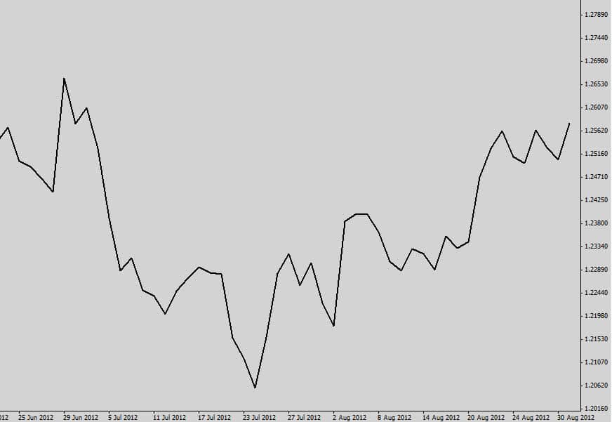
A line graph Forex charting formats offer very limited data, displaying only the ‘close’ price for each time slot.
It’s not used very much in today’s trading due to the lack of information the Forex charting format provides.
The Bar Chart
The bar chart is a much improved format of Forex charting, offering more data than the simple line chart. Just like the line chart, the X-axis has consistent time intervals, depending on what time frame you choose and the price value on the Y-axis.
The bar chart contains 4 times the amount of data than the line chart…
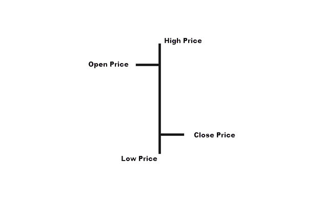
- High Price: The highest price the bar reached during the time it was open.
- Low Price: The lowest price the bar reached during the time it was open.
- Open Price: The left lug is the price the bar opened at.
- Close Price: The right lug is the price the bar closed at.
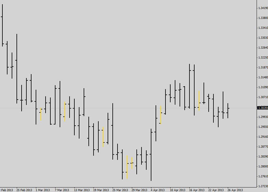
Bar charts allow traders to get a better understanding of what happened during that bar’s session to help make them more confident trading decisions.
A new improved version of displaying these 4 points of data called Japanese candlestick charts was brought out and is used by most traders today. More on candlestick charts in the next chapter.
Price Gaps
In theory the close price of the previous bar should be the same as the open price as the next bar. Sometimes within the milliseconds of time it takes to open a new bar, price fluctuations and causes a ‘price gap’.
Gaps between normal day to day bars are negligible, but large financial news events can occur over the weekend. These unexpected weekend news bombs can cause a massive gap between the market close price for the week (Friday’s Candle), and the open price of the new trading week.
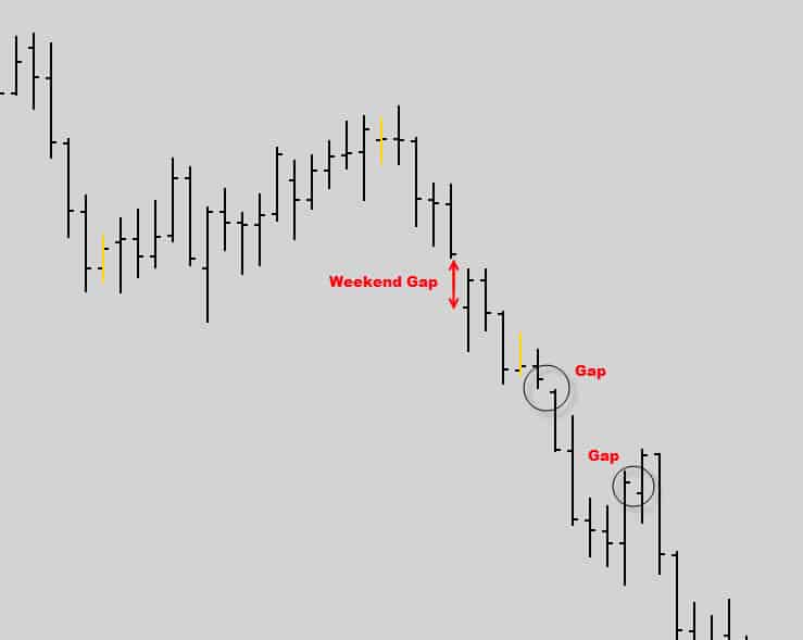
Notice how the open and close prices don’t line up due the weekend price gaps. This is why some traders don’t like to hold their positions over the weekend.
There is a chance price can ‘gap’ over your stop loss, and you would lose more than you intended to risk on the trade. On the flip side gaps can ‘jump’ your trade into nice profits, but it is a risk most traders are not willing to take.
Renko Charts
Renko Forex charting were invented by the Japanese. Renko charts adopted their name from the Japanese word ‘renga’ which means brick, because Renko charts look like stacks of bricks.
A Renko chart still has time located on its X-axis but it’s not locked in consistency like the bar and line chart. This is what makes a Renko chart unique – it simply doesn’t care about time.
This Forex charting is made up of bricks which are either bullish or bearish.
A new brick will only form if price moves a predefined amount of points. If the Renko chart is set to 100 points, and price is stuck in tight consolidation for weeks no new bricks will appear on the chart.
A new brick will only appear when price breaks out of consolidation and starts moving more than 100 points. The renko chart doesn’t care if this takes 1 minute or 1 month.
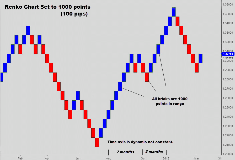
Renko Forex charting takes time out of the price feed and responds only to price movements to create the new bricks. Renko charts filter out a lot of the noise and can give traders a unique way to determine trends and price momentum.
Renko Forex charting is a nice way to filter out low volatility trading environments.
Renko charts have always been around, but only now are traders starting to realize their existence and utilizing them with unique Renko based trading strategies.
At the moment not many trading platforms offer Renko charts, and if they do you must buy them or pay a monthly fee, which is a bummer. There are free third party renko chart generators for MT4. A quick google search will get you to the right place.
In the next chapter we will cover the most commonly used price chart format, the Japanese Candlestick.
