Welcome to the second part of the Forex charting chapter. In this chapter we are going to cover the most popular charting format used by traders in the markets today.
Candlesticks are more aesthetically pleasing and easier to analyse. Japanese candlesticks have now been adopted as the industry standard.
Where did Japanese candlesticks Come From?
Ok, I know ‘Japanese’ part might be obvious. But, Until Japanese candlestick charting was discovered most traders used bar charts, which we covered in the last chapter.
While everyone was using bar charts in the western parts of the world, the Japanese were using candlesticks to technically analyse their rice markets, which they had been doing since the 18th century.
It wasn’t until Steve Nison discovered the Japanese candlestick trading techniques rice traders were using and introduced it to the west in his book ‘Japanese Candlestick Charting Techniques’ in 1991 that we started to utilize this new powerful charting method.
The Candlestick Anatomy
The Japanese candlestick essentially is just a visual improvement of the bar chart. Japanese candlesticks provide the same data but in a much visually friendly, interpretable way.
Like the bar chart, each single bar gives us a high, low, open and close price. Each candle on a candlestick chart would display the same information, just better.
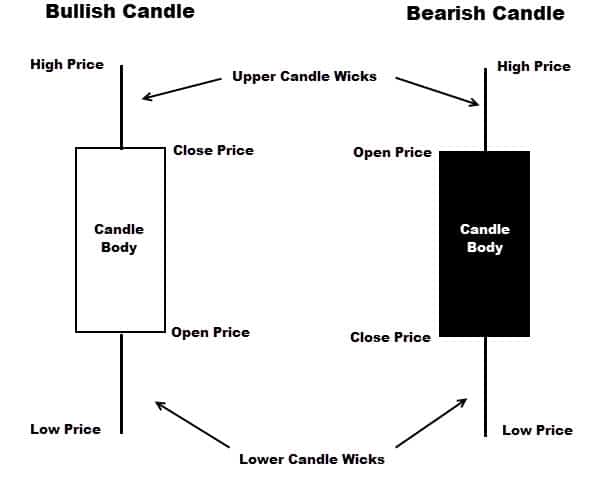
High Price: The top of the candle is the highest price the candle reached during its open time.
Low Price: The bottom of the candle is the lowest price the candle reached during the time it was open.
Open Price: The price the candle opened at. For a bullish candle this will be the bottom of the candle body, for a bearish candle the open price will be the top of the body.
Close Price: The closing price of the candle. A bearish candle’s close will be the bottom of the body and bullish candle’s price will the top of the candle body.
Candle Body: The candle body is the thick part of the candlestick that represents the distance between the open and close price. If the close is higher than the open then the candle closed bullish and will show a bullish candle body. If the candle closed lower than its open it’s a bearish candle and will show a bearish body.
The thicker the body the more buying or selling pressure there was in that candle’s open period.
Candle Range: The candle range is the distance between the candle high and the candle low. Large candle ranges indicate high volatility. Usually candles with large ranges are generated from large news, or economic events.
Upper candle wick: The upper candle wick is the line that produces from the top of the candle body and represents the distance between the candle high and body top.
Lower candle wick: The lower candle wick produces from the lower end of the body and represents the distance between the low price and the candle body bottom.
Candle wicks are sometimes called ‘tails’ or ‘shadows’. Large upper wicks communicates bearish rejection of price, large lower wick indicate bullish rejection. Candles with large wicks are called Rejection Candles (Pin Bars from the old bar charts). These are a trading signal we teach in the War Room price action course.
Comparing the two
Have a look at the bar chart and Japanese candlestick chart below; they are exactly the same chart just in the different formats.
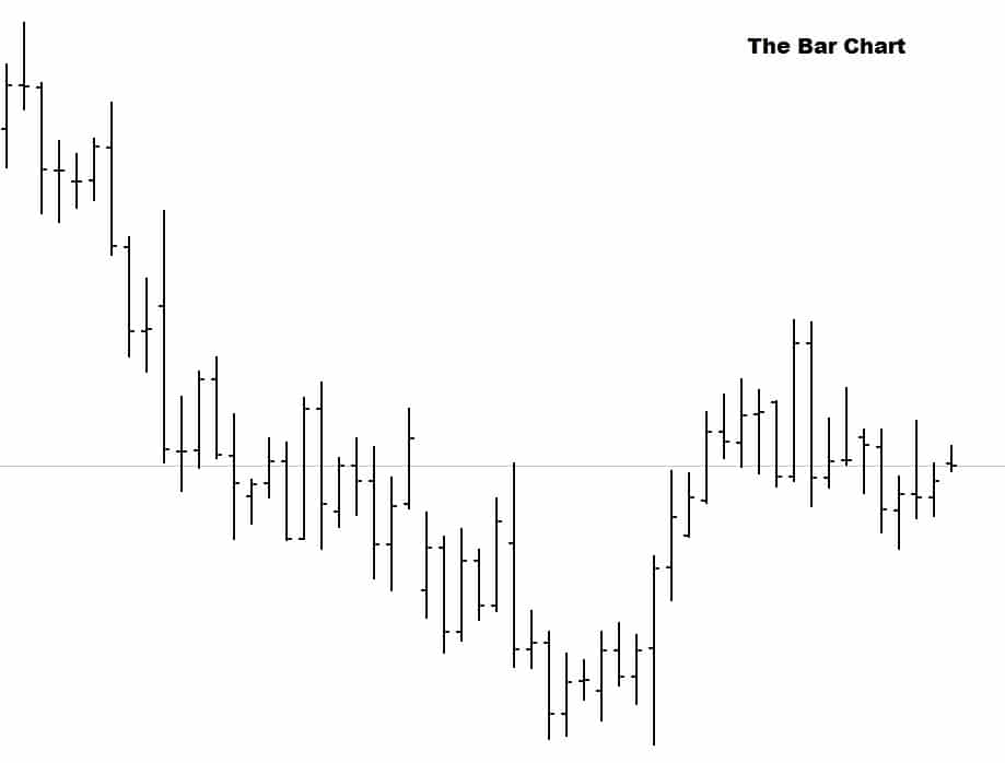
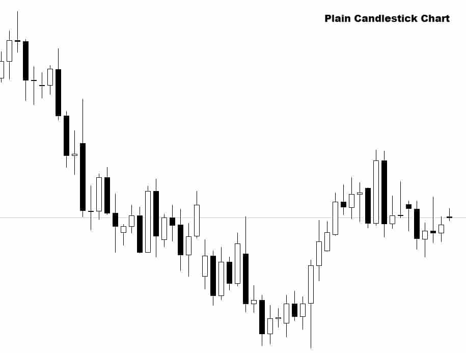
When you put the charts side by side you can really tell the difference, the plain Japanese candlestick has so much more clarity than the bar chart.
The candlestick chart is more pleasing to the eye and is easy to understand why it is the preferred format.
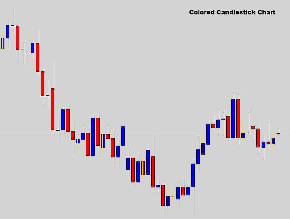
Charting software today allows you to change the color template of your Japanese candle chart to create an even more aesthetically pleasing Japanese candlestick chart template to work with.
Some traders even like to rotate their color template every so often as it can be boring looking at the same one after time. What ever works for you, as long as the chart remains readable.
Candle Volume
This is something that we haven’t covered yet but charting software generally offers ‘candle volume’. If you use MT4 press CTRL+L and you will see a histogram popup at the bottom of the screen.
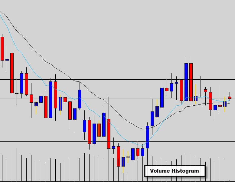
In the previous chapters we talked about centralized vs. decentralized markets. The stock market is centralized so market volume can be measured accurately.
Trade volume data in centralized markets contains bull volume and bear volume.
In decentralized markets, like the Forex market. Volume cannot be measured properly because transactions take place across all different networks.
You’re thinking, where’s this volume data on my charting platform coming from then?
The volume on your Forex charting platform is called ‘tick volume’. When price changes value, this is called a ‘tick’, if price has ticked up or down then a transaction has taken place.
The problem is we don’t know how big the transaction was and if it was just one transaction or multiple transactions fired off in close proximity to one another to make the market price tick.
This is why ‘tick volume’ is inaccurate and does not compare to the accurate stock market volume data.
In conclusion, Forex volume is comprised of how many times that candle ticked during its open period. We don’t use Forex volume with our technical price action analysis here at The Forex Guy.
So why make the switch to Japanese candlesticks?
- Japanese candlesticks provide all the data a bar chart does, but in a superior aesthetical format.
- Japanese candlesticks allow better, faster technical interpretation of the charts.
- All the classic bar chart signals can be applied directly to Japanese candlesticks.
- Japanese Candlesticks visually display supply and demand in each candle body.
Heiken Ashi Candles
The Japanese strike again with another set of candlestick charting format called ‘Heiken Ashi candlesticks’. Heiken Ashi translates to ‘Average Candles’ in Japanese.
The Japanese knew that most money was made in trading when the markets were trending in a clear direction, so they came up with a candlestick that helped filter out market noise and display the core trend direction.
Heikin Ashi candlesticks are generated by applying some simple average maths to each of the 4 data points of the original candlestick, the high, low, open and close.
- xClose = (Open+High+Low+Close)/4 = Average price of the current bar
- xOpen = [xOpen(Previous Bar) + Close(Previous Bar)]/2 = Midpoint of the previous bar
- xHigh = Max(High, xOpen, xClose) = Highest value in the set
- xLow = Min(Low, xOpen, xClose) = Lowest value in the set
To get access to the Heiken Ashi candlestick you can download external indicators that generate them, more advanced charting software packages now are starting to have Heiken Ashi candles built into their normal functionality.
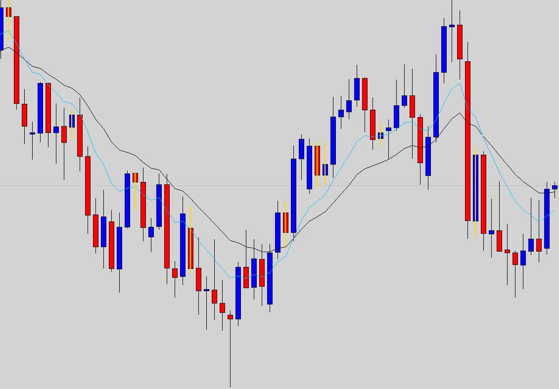
Let’s have a look and see how they look compared with a normal Japanese candlestick chart.
Normal Japanese Candlesticks
Heiken Ashi Candlesticks
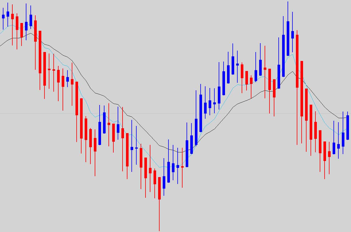
When comparing the two charts you can see the smoothing out power the Heikin Ashi candlestick layout provides.
Although it does look good in hindsight, traders must exercise caution, Heiken Ashi bodies don’t always match up with the relative value in price, so you must be very mindful of this.
Keep in mind the candles are generated using weighted average math. A Heiken Ashi candle may look like it’s indicating the chart is sitting at a price value when it’s actually a bit of an optical illusion. Double check the real price value before placing trades.
Heiken Ashi candles make it easier to spot trends, determine trend strength, and spot potential buying and selling opportunities just with a quick glance on the chart.
We are firm believers of trading with pure price action here at The Forex Guy. However we are opened minded, and find Heiken Ashi charts interesting and thought they deserved a mention in this chapter.
In the next chapter we will be looking at some common Japanese candlestick patterns that can be used in conjunction with price action trading, and many other technical trading systems.

James Mclaughlin
Hi, i enjoy reading your articles and watching your videos. I have a question about the open and close times of the candlesticks on the daily charts. What time zone are the open and close prices taken from? I’m in the UK and i’ve been dabbling with forex and the daily chart candlestick open & close for my broker is 0:00GMT to 24:00GMT respectively. It seems I can’t change this. However i’ve since read that I should be looking at charts with daily candlesticks where the open & close is based on the New York market close since that is what the big players use, therefore 22:00GMT TO 22:00GMT I believe. What is the correct type of daily chart I should be looking at?
Thanks, James
Replying to: James Mclaughlin
Dale WoodsAuthor
You can use any chart you want, but price feeds synced to the New York close are considered the industry standard.
Replying to: James Mclaughlin
James McLaughlin
For the charts that you yourself use via Go Markets, are the daily candlesticks for the New York close?
Pieter Streicher
The Heiken Ashi Candlesticks sound enticing. Where can I find and download external indicators that generate them,
yusoff
excuse me, I’m very excited to host the description of price action. I want to know who the master MA or EMA use the blue lines and black ASAP. Thank you.
Replying to: yusoff
Dale WoodsAuthor
They are the 10 & 20 EMAs set to the close price.